css 使用:checked实现自定义单选框、复选框、开关、标签复选、素材单选等实用实战案例
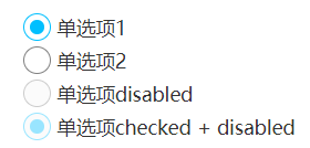
自定义单选框
效果见 https://demo.cssworld.cn/selector/9/2-3.php
<p>
    <input type="radio" id="radio1" name="radio" checked>
    <label for="radio1" class="cs-radio"></label>
    <label for="radio1">单选项1</label>
    <input type="radio" id="radio2" name="radio">
    <label for="radio2" class="cs-radio"></label>
    <label for="radio2">单选项2</label>
    <input type="radio" id="radio3" disabled>
    <label for="radio3" class="cs-radio"></label>
    <label for="radio3">单选项disabled</label>
    <input type="radio" id="radio4" checked disabled>
    <label for="radio4" class="cs-radio"></label>
    <label for="radio4">单选项checked + disabled</label>
</p>
/* 单复选框 */
[type="radio"],
[type="checkbox"] {
    position: absolute;
    width: 20px; height: 20px;
    opacity: 0;
    cursor: pointer;
}
/* 单选框 */
.cs-radio {
  display: inline-block;
  width: 20px; height: 20px;
  border: 1px solid gray;
  border-radius: 50%;
  background-color: #fff;
  box-sizing: border-box;
  vertical-align: -.5ex;
  user-select: none;
  transition: border-color .2s;
  overflow: hidden;
}
:focus + .cs-radio,
:checked + .cs-radio {
  border-color: deepskyblue;
}
:checked + .cs-radio::before {
  content: "";
  display: block;
  width: 10px; height: 10px;
  margin: 4px auto 0;
  border-radius: 50%;
  background-color: deepskyblue;
}
:disabled + .cs-radio {
  background-color: #f5f5f5;
  opacity: .4;
}
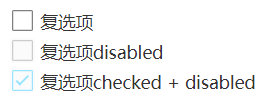
自定义复选框
效果见 https://demo.cssworld.cn/selector/9/2-3.php
<p>
    <input type="checkbox" id="checkbox">
    <label for="checkbox" class="cs-checkbox"></label>
    <label for="checkbox">复选项</label>
    <input type="checkbox" id="checkbox2" disabled>
    <label for="checkbox2" class="cs-checkbox"></label>
    <label for="checkbox2">复选项disabled</label>
    <input type="checkbox" id="checkbox3" checked disabled>
    <label for="checkbox3" class="cs-checkbox"></label>
    <label for="checkbox3">复选项checked + disabled</label>
</p>
/*复选框*/
.cs-checkbox {
  display: inline-block;
  width: 20px; height: 20px;
  border: 2px solid transparent;
  border-radius: 4px;
  color: gray;
  box-shadow: inset 0 0 0 1px;
  background-color: #fff;
  box-sizing: border-box;
  vertical-align: -.5ex;
  user-select: none;
  transition: color .2s;
  overflow: hidden;
}
:focus + .cs-checkbox,
:checked + .cs-checkbox {
  color: deepskyblue;
}
:checked + .cs-checkbox::before {
  content: "";
  display: block;
  width: 8px; height: 3px;
  border-left: 2px solid;
  border-bottom: 2px solid;
  margin: 4px auto 0;
  -ms-transform: rotate(-45deg);
  transform: rotate(-45deg);
}
:disabled + .cs-checkbox {
  background-color: #f5f5f5;
  opacity: .4;
}
开关
效果见 https://demo.cssworld.cn/selector/9/2-4.php
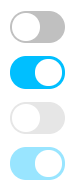
<!-- 普通状态 -->
<input type="checkbox" id="switch">
<label class="cs-switch" for="switch"></label>
<!-- 选中状态 -->
<input type="checkbox" id="switch1" checked>
<label class="cs-switch" for="switch1"></label>
<!-- 禁用状态 -->
<input type="checkbox" id="switch2" disabled>
<label class="cs-switch" for="switch2"></label>
<!-- 选中禁用状态 -->
<input type="checkbox" id="switch3" checked disabled>
<label class="cs-switch" for="switch3"></label>
[type="checkbox"] {
    width: 44px; height: 26px;
    position: absolute;
    opacity: 0;
    pointer-events: none;
}
/* 开关样式 */
.cs-switch {
  display: inline-block;
  width: 44px; height: 26px;
  border: 2px solid;
  border-radius: 26px;
  background-color: currentColor;
  box-sizing: border-box;
  color: silver;
  transition: all .2s;
  cursor: pointer;
}
.cs-switch::before {
  content: "";
  display: block;
  width: 22px; height: 22px;
  border-radius: 50%;
  background-color: #fff;
  transition: margin-left .2s;
}
/* 若干状态控制 */
:active:not(:disabled) + .cs-switch::before {
  box-shadow: inset 1px 1px 1px rgba(0, 0, 0, 0.1);
}
:checked + .cs-switch {
  color: deepskyblue;
}
:checked + .cs-switch::before {
  margin-left: 18px;
}
:focus-visible + .cs-switch {
  outline: 1px dotted Hightlight;
  outline: 5px auto -webkit-focus-ring-color;
}
:disabled + .cs-switch {
  opacity: .4;
  cursor: default;
}
标签复选
效果见 https://demo.cssworld.cn/selector/9/2-5.php
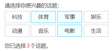
<h4>标签的选择</h4>
请选择你感兴趣的话题:<br>
<input type="checkbox" id="topic1"><label for="topic1" class="cs-topic">科技</label>
<input type="checkbox" id="topic2"><label for="topic2" class="cs-topic">体育</label>
<input type="checkbox" id="topic3"><label for="topic3" class="cs-topic">军事</label>
<input type="checkbox" id="topic4"><label for="topic4" class="cs-topic">娱乐</label>
<input type="checkbox" id="topic5"><label for="topic5" class="cs-topic">动漫</label>
<input type="checkbox" id="topic6"><label for="topic6" class="cs-topic">音乐</label>
<input type="checkbox" id="topic7"><label for="topic7" class="cs-topic">电影</label>
<input type="checkbox" id="topic8"><label for="topic8" class="cs-topic">生活</label>
<p>您已选择<span class="cs-topic-counter"></span>个话题。</p>
[type="checkbox"],
[type="radio"] {
    position: absolute;
    clip: rect(0 0 0 0);
}

.cs-topic {
    display: inline-block;
    width: 64px;
    margin-top: 5px;
    padding: 5px 0;
    border: 1px solid silver;
    text-align: center;
    cursor: pointer;
}
.cs-topic:hover {
    border-color: gray;
}
:checked + .cs-topic {
    border-color: deepskyblue;
    background-color: azure;
}
/* 选择计数器 */
body {
    counter-reset: topicCounter;
}
:checked + .cs-topic {
    counter-increment: topicCounter;
}
.cs-topic-counter::before {
    color: red;
    margin: 0 2px;
    content: counter(topicCounter);
}
素材单选
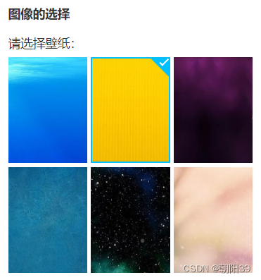
<h4>图像的选择</h4>
请选择壁纸:<br>
<input type="radio" id="wallpaper1" name="wallpaper" checked>
<label for="wallpaper1" class="cs-wallpaper">
    <img src="1.jpg" class="cs-wallpaper-img">
</label>
<input type="radio" id="wallpaper2" name="wallpaper">
<label for="wallpaper2" class="cs-wallpaper">
    <img src="2.jpg" class="cs-wallpaper-img">
</label>
<input type="radio" id="wallpaper3" name="wallpaper">
<label for="wallpaper3" class="cs-wallpaper">
    <img src="3.jpg" class="cs-wallpaper-img">
</label>
<input type="radio" id="wallpaper4" name="wallpaper">
<label for="wallpaper4" class="cs-wallpaper">
    <img src="4.jpg" class="cs-wallpaper-img">
</label>
<input type="radio" id="wallpaper5" name="wallpaper">
<label for="wallpaper5" class="cs-wallpaper">
    <img src="5.jpg" class="cs-wallpaper-img">
</label>
<input type="radio" id="wallpaper6" name="wallpaper">
<label for="wallpaper6" class="cs-wallpaper">
    <img src="6.jpg" class="cs-wallpaper-img">
</label>
.cs-wallpaper {
    display: inline-block;
    width: 90px; height: 120px;
    margin-top: 5px;
    vertical-align: bottom;
    position: relative;
    overflow: hidden;
    cursor: pointer;
}
.cs-wallpaper-img {
    display: block;
    height: 100%; width: 100%;
}
:checked + .cs-wallpaper::before {
    content: "";
    position: absolute;
    left: 0; right: 0; top: 0; bottom: 0;
    border: 2px solid deepskyblue;
    background: linear-gradient(-135deg, deepskyblue 14px, transparent 15px);
}
:checked + .cs-wallpaper::after {
    content: "";
    position: absolute;
    right: 2px; top: 3px;
    width: 8px; height: 3px;
    color: white;
    border-left: 2px solid; border-bottom: 2px solid;
    -ms-transform: rotate(-45deg);
    transform: rotate(-45deg);
}